How to apply a data lens to your program evaluation

Follow these simple steps to set up your data and analysis.
Are you applying for funding for a new program and need to show your impact with a data and evaluation plan? Or maybe you haven’t collected data or evaluated programs before?
In this guide, we’ll detail the steps you can take to recognise your data needs, grow your organisation’s data culture, build confidence capturing and analysing your data, and ensure your data collection is fit for purpose.
1. Start with a simple theory of change
A theory of change (ToC) is a detailed visualisation of how and why your project achieves the intended outcomes.
Mapping how your activities lead to desired outcomes and impact will help formulate your data plan and also take a step towards growing a strong data culture within your organisation.
Downloadable theory of change template with examples
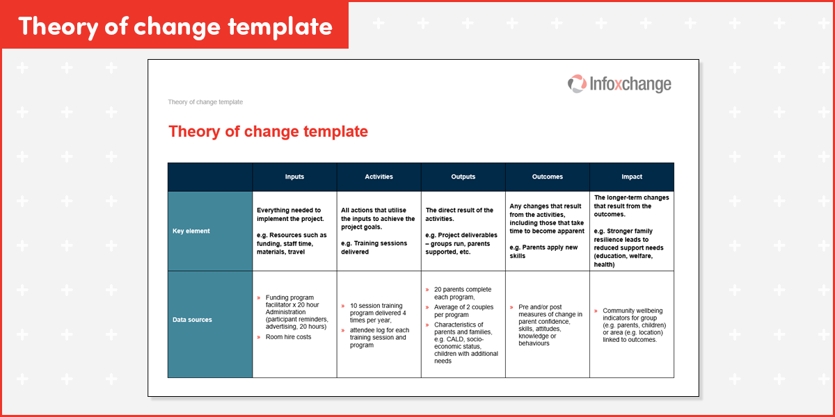
Download this Theory of Change template down below
Identify data points for each element
Picture the flow of events, impacts, and measures to help stakeholders understand the role of data in communicating the impact of the work.
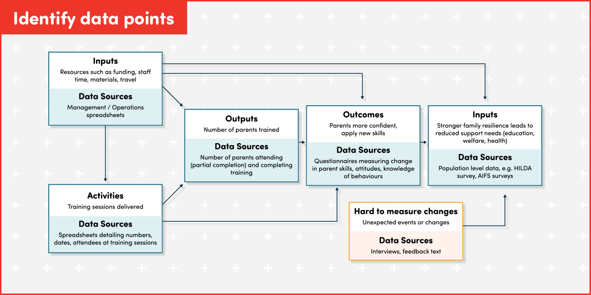
Note: HILDA Survey, AIFS surveys
2. Collect, analyse, report
Now it’s your chance to turn raw data into insights for reporting and decision-making with your analytics plan. Create a structured pathway to move beyond ad-hoc reporting or just showing services delivered to demonstrating how your organisational purpose and goals are being achieved.
Collect
Use tools like Microsoft forms, Survey Monkey or Qualtrics to collect data and then export it to spreadsheets.
Tip: Ensure that your spreadsheet set up is correct for the analytics requirements as some tools will export column setups that need further manipulation before you can analyse and report.
Analyse: Tools & methods
Cleaning: A vital step! Make sure that all your data is clean. This includes checking for spelling mistakes, spaces before and after data in cells, and inconsistencies like ‘NSW’ and ‘New South Wales’.
Tip: Use Copilot to help guide you with data cleaning, ensuring only snippets of unidentifiable data go into your prompt, eg. Copy-paste a section of data from each column into the prompt and ask for cleaning suggestions.
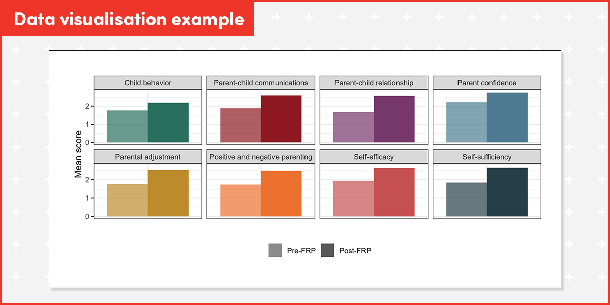
Analysis: For simple or once-off data collection, you can analyse and visualise within spreadsheets. If working with ongoing data collection, or looking for more complex analysis, you may want to explore exporting your data to tools like Power BI or Looker Studio.
Analysis should match your theory of change. For example, if you aim to show that parenting training increases parent confidence then compare pre and post parent confidence measures for change.
Which analysis method best suits you?
Descriptive Analysis
Descriptive analysis is used to summarise the key features of your dataset. It provides a high-level overview of your results and is ideal when you want to describe specific patterns within a group. By using common methods such as the mean (average), frequencies, and percentages, you can get a clear picture of your data at a glance. For instance, you might use this method to find the average confidence rating among parent survey participants or to calculate exactly how many parents reported being satisfied with a program.
Qualitative Analysis
When dealing with open-ended or text-based responses, qualitative analysis is the appropriate choice. This method examines narrative feedback or qualitative research to uncover underlying themes and meanings. Common techniques include thematic coding and content analysis. A practical application of this would be identifying the most common themes that appear in written feedback provided by parents, allowing for a deeper understanding of their perspectives beyond simple numbers.
Comparative Analysis
Comparative analysis helps you understand whether the differences observed between groups—such as before and after people participate in a program—are likely due to the program itself rather than just chance or natural variation. This method is essential when comparing categories like age groups, different program sites, or participants' progress over time.
Common statistical methods used here include T-tests and ANOVA for comparing average scores, or Chi-square tests for comparing categories like "Yes/No" outcomes. While these may sound complex, most Not-for-Profits (NFPs) can seek assistance from volunteer analysts or online tools to perform these calculations.
A Practical Note: If you notice that average results look better after a program, you can only report those as a "descriptive" finding (e.g., "scores improved"). To confidently state that the improvement was caused by the program, a formal comparative analysis is required.
Managing hard-to-measure changes
Not all changes can be easily measured or quantified and you may also include insights developed from delivering programs, like client stories, sharing data collection lessons, or external factors (eg. Our results were impacted by a natural disaster during the program, so we have also included client stories to show how the program benefits also supported clients during this difficult time).
Consider the following options:
- Use qualitative data: stories, analysis of social media posts or other non-traditional datasets
- Partner with researchers for theoretical frameworks and setting up analytics plans
- Consider creating new datasets if you’re doing pioneering work!
Report and visualise
Data Visualisation
Do you need a dashboard, or will simple charts created in your spreadsheet be enough to communicate impact for stakeholders?
Reporting to stakeholders
Share learnings with internal and external stakeholders. Starting with internal stakeholders, invite them to sense-check the data and help interpret it. Do these findings align with their observations? If not, what is different? Use this information to modify the analysis, and/or shape your interpretation of the data.
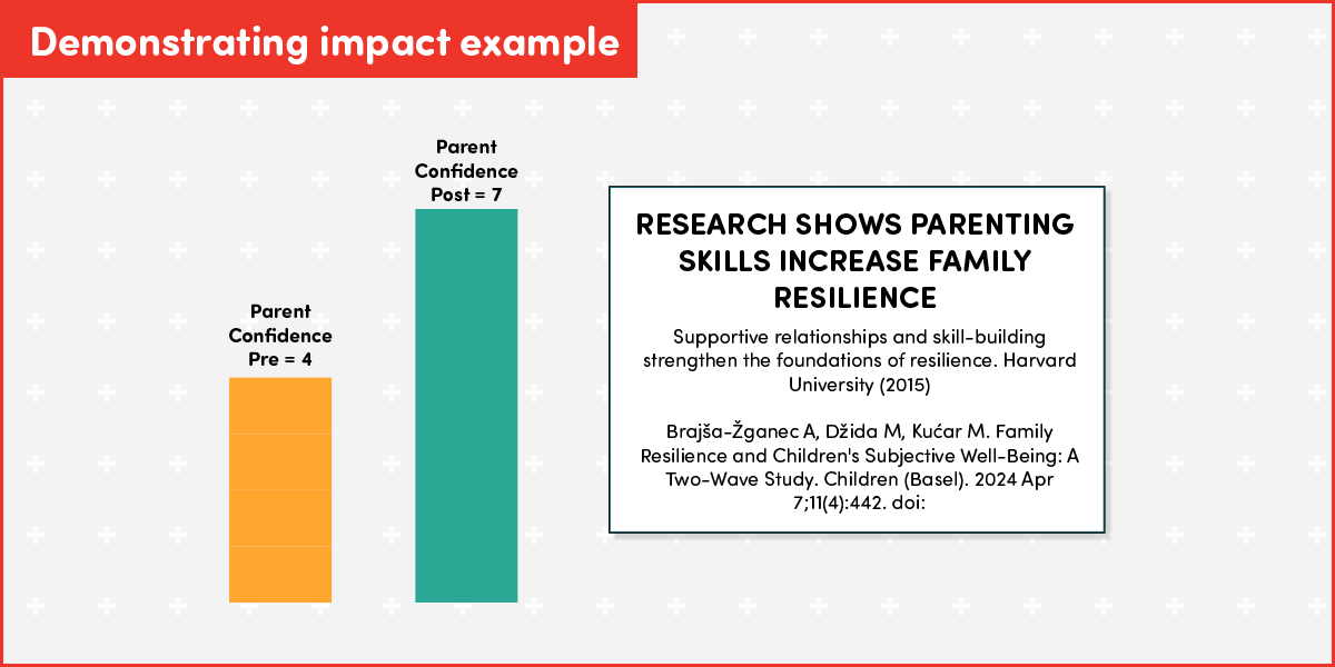
For external stakeholders; alongside showing the numbers of clients/recipients served, show how your programs are making a difference for clients/recipients and how this is linked to long-term impacts.
*Note that this is a descriptive analysis and no claims are made that the intervention has led to the change in parent confidence observed.
3. Using AI to assist your planning
AI can help you set up, think through and troubleshoot your theory of change and analytics plan. An example prompt like this will give you a more detailed response that you can further refine.
Prompt example:
Help me design a logic model and data collection plan for a not-for-profit parenting skills [place your program information here] training program. The logic model should include:
- Inputs (resources)
- Activities (what the program does)
- Outputs (direct products of activities)
- Short-term outcomes (immediate changes in knowledge, skills, attitudes)
- Medium-term outcomes (behavioural changes)
- Long-term impacts (community-level or systemic changes).
Then, create a data plan that specifies:
- Key indicators for each outcome and impact
- Data sources (e.g., surveys, administrative data)
- Collection methods and frequency
- Responsible parties
- How data will be used for learning and improvement.
- Make it clear, practical, and tailored for a nonprofit context
Join our Data Catalyst Network (Australia only)
Connect with your peers from across the social justice sector in Australia as you share and discuss data challenges and opportunities. The Data Catalyst Network enables not-for-profit organisations working to support children, families and communities to use data more effectively to shape services and achieve their outcomes.


Status message
Thanks for rating this guide.